Let’s face it—designing on a budget can feel like cooking without spices. But here’s the good news: free stock images are the designer’s equivalent of a well-stocked spice rack. They add flavor, depth, and style to any project without costing a penny. Whether you’re working on creative design projects or client work, free stock images for design projects can be a game-changer, offering high-quality visuals that elevate your work without breaking the bank. In this guide, you’ll discover 11 essential tips tailored to modern design trends, from eco-friendly themes to retro vibes, to help you make the most of these valuable resources—legally and for free!
1. Eco-Friendly and Sustainable Design Themes
The world is going green, and so is design! More brands and audiences appreciate visuals that reflect sustainability and eco-consciousness. To tap into this trend, look for images featuring nature, organic elements, or sustainable products.
- Social media visuals for green brands: Eco-friendly companies can use images of natural landscapes, forests, or mountains to reinforce their brand identity and commitment to sustainability. These images make followers feel connected to the mission.
- Zero-waste packaging visuals: For sustainable products, I used a serene stock photo of fresh green leaves on a plain white background. It communicated purity and environmental responsibility without needing excessive editing.
- Climate change presentations: For awareness campaigns, images of solar panels, wind farms, or clean energy sources bring credibility to sustainability presentations. Unsplash has an excellent selection of eco-friendly visuals for free use.
2. Minimalism and Negative Space Techniques

Less is more—especially when it comes to minimalist designs. Images with negative space are perfect for making text, graphics, or product elements stand out without overwhelming the viewer.
- Website hero images: On a minimalist website, a single leaf on a white background created a calming, sophisticated look, perfect for text overlays and call-to-action buttons. Negative space helps the key message shine.
- Event posters with clean designs: Posters using minimalist images with negative space can focus attention on typography and event details. A subtle image of a plain desk or wall with ample white space adds a modern touch to event promotions.
- Email product launch visuals: A clean background with just a hint of texture (like marble or linen) makes product images pop, adding sophistication. Negative space can direct attention to headlines and product details without visual clutter.
- Instagram quotes with subtle textures: Backgrounds with minimal textures, like light wood or pastel colors, let typography take center stage, creating a balanced yet engaging post that feels high-end and curated.
3. Diverse Representation and Inclusivity in Design
Inclusive visuals are essential in today’s world. Many brands now seek images that celebrate diversity across ethnicities, genders, and abilities, creating a more welcoming and representative brand experience.
- Diversity-focused marketing campaigns: For a healthcare project, I chose images that showed a diverse group of healthcare workers collaborating. This visual approach made the campaign relatable, showing inclusivity in action.
- Social media for lifestyle brands: Diverse images can add warmth and authenticity to lifestyle brands, reflecting values of inclusivity. Whether it’s family gatherings, work settings, or friends hanging out, Burst and Nappy offer a variety of inclusive options.
- Event promotions for youth-focused brands: Using photos of people from different backgrounds celebrating together brought energy and relatability to a youth event poster, ensuring it resonated with a broad audience.
4. Retro and Vintage Aesthetic for Nostalgia Marketing
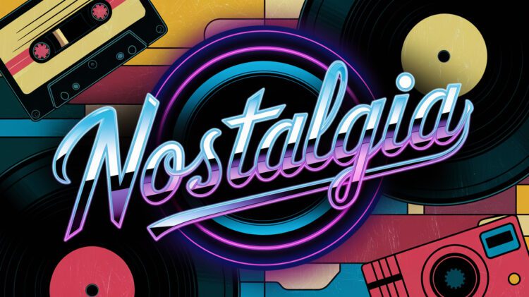
Retro is back! Nostalgic visuals from the 70s, 80s, and 90s appeal to audiences who connect with vintage styles, making them ideal for designs that want to evoke fond memories and emotional connections.
- Social media throwback posts: For a “Throwback Thursday” series, images of Polaroid cameras, old vinyl records, or neon signs instantly bring a nostalgic touch. These visuals connect with audiences who have a soft spot for retro vibes.
- Vintage packaging for products: I used stock images with grainy, sepia tones to create a classic feel for a soda brand. These visuals convey the character of old-school branding, especially with warm, retro colors.
- Email marketing with retro visuals: Incorporating a subtle, vintage-inspired background image, like a faded wallpaper pattern, can elevate email designs. This creates a soft, nostalgic effect that stands out from typical modern designs.
- Product launch graphics with a retro twist: Adding retro-themed backgrounds with vintage filters brings character and originality to launch graphics, setting them apart from conventional styles.
5. Augmented Reality (AR) and Interactive Design Elements
AR is becoming more accessible, and stock images can be a fantastic starting point for creating immersive, interactive experiences. These visuals can bring life to projects that need that extra layer of engagement.
- AR filters for social media campaigns: For a travel-themed AR filter, I started with a stunning landscape image of a mountain range. This created an engaging background, making users feel transported to a scenic location.
- Virtual video backgrounds: Stock images of landscapes or cityscapes make great virtual backgrounds for video calls, enhancing the professional yet personalized look of virtual presentations and meetings.
6. Typography-Centric Designs Using Stock Backgrounds
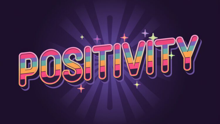
Typography-focused designs are popular for posters, social media graphics, and more. Simple stock image backgrounds work well here, keeping the focus on bold fonts and statements.
- Inspirational quote posts for Instagram: A subtle marble texture made the perfect backdrop for a quote post, adding an elegant touch without overwhelming the text.
- Event poster design: Using a lightly textured or solid color background helps typography stand out, making the message bold and memorable. This approach works well for promotional posters.
- Presentation slides: For a professional conference, I used a gradient background image in the slides to add depth, ensuring that the focus remained on the content itself while maintaining a polished look.
7. Evoking Emotions with Cinematic and Moody Images
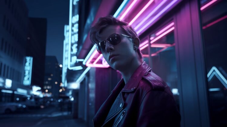
Images with a cinematic, moody tone can add depth and emotional appeal, making them ideal for storytelling or projects that need to convey a specific mood.
- Art gallery flyers: I used a dark, atmospheric image of a street at dusk to set a mysterious tone for an art gallery’s promotional flyer. This kind of image adds an element of intrigue, drawing the viewer in.
- Fashion lookbooks with an editorial vibe: For a high-end feel, shadow-heavy and high-contrast images work well in lookbooks, giving the collection an editorial and exclusive appearance.
- Travel blog visuals: For a travel story about mountain hikes, a moody image of misty forests added a layer of drama and emotional connection, enhancing the reader’s journey through the content.
8. Animated GIFs and Motion Graphics for Digital Media
Why stick to static images when you can add movement? Animated stock graphics and GIFs are engaging and add a dynamic touch to digital projects.
- Social media stories with movement: Short animated stock videos or GIFs bring static designs to life, perfect for eye-catching Instagram or Facebook stories that capture attention instantly.
- Email banners with subtle animations: Adding a GIF to an email banner, like a twinkling star or a moving arrow, can add a hint of excitement without overwhelming the viewer.
- Blog visuals that enhance engagement: Adding a GIF to blog posts or product pages can draw attention to important information, making it a great tool for light-hearted or engaging topics.
- Presentation enhancements: Incorporating GIFs or simple motion graphics into presentations helps keep the audience’s attention focused, especially for key slides that convey critical information.
9. High-Quality Textures for Backgrounds and Overlays

Textures can add depth and richness to any project. Whether you’re looking for a rustic wood grain, a soft paper texture, or even gritty concrete, textures can serve as great backgrounds or overlays.
- Packaging design for artisan brands: For a handmade candle brand, I used a soft paper texture as a background, enhancing the organic and artisanal feel of the packaging and reinforcing the natural branding.
- Vintage blog post overlays: Adding fabric or stone textures to blogs or websites can add a sense of depth, creating a vintage, handcrafted look that enhances reader engagement.
10. Flat Illustration and Icon Sets for Social Media and Web
Flat illustration and icons are popular for web and mobile interfaces because they’re clean, simple, and modern. They’re particularly useful in creating cohesive, minimalist designs.
- App interface design: I used flat icons from Iconscout in a mobile app interface, making the design look cohesive and easy to navigate, with clean lines and clear iconography.
- Social media graphics with a modern feel: Flat illustrations from Freepik bring a fresh and vibrant style to Instagram stories, adding a sense of energy and professionalism.
- Website UI elements: Vector icons from stock sites can add a unified look, helping websites appear modern, polished, and easy to navigate.
- Infographics for engaging content: Flat icons work well in infographics, making information easier to digest while keeping the visual style simple and engaging.
11. Legal Considerations and Licensing Tips for Free Stock Images for Design Projects
And there you have it—11 tips to supercharge your creative design projects with free stock images! From earthy, eco-friendly vibes to retro nostalgia, there’s a world of options out there to explore.
